Our objective for this project was to create a systematic packaging. This design will be used for our retail environment. Moreover, we wanted to strengthen our brand with a creative and dynamic approach. Knock came to assist us in the development of our packaging. All the labs came together and researched for packaging inspiration. We finally came up with a package design that speaks to our identity and aesthetic.
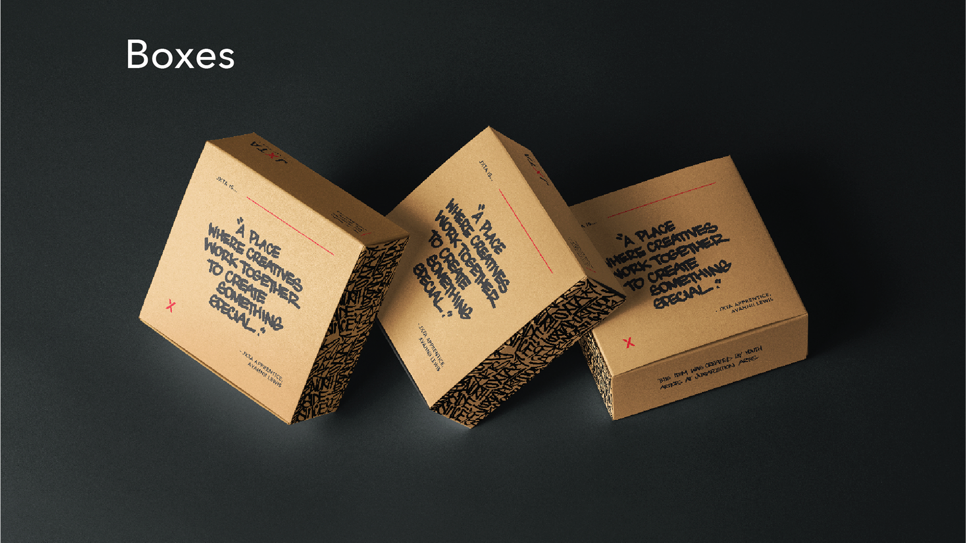
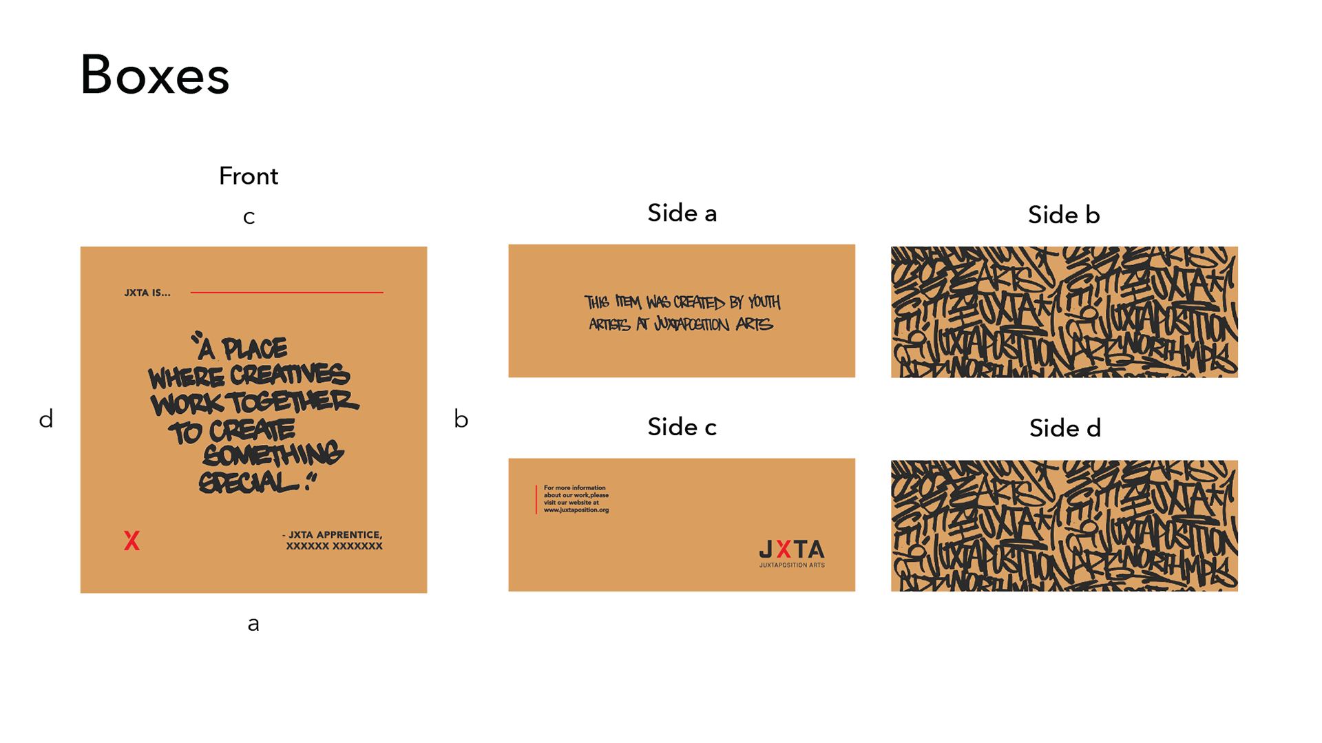
We decided to use the graffiti typography made by our textile leader, Alex. We started with graffiti, screen printing, and murals. As a result, the packages will had the typography correspond with the quotes by our apprentices. The quotes expressed what JXTA is to them or the community.
The final product of the box puzzles.
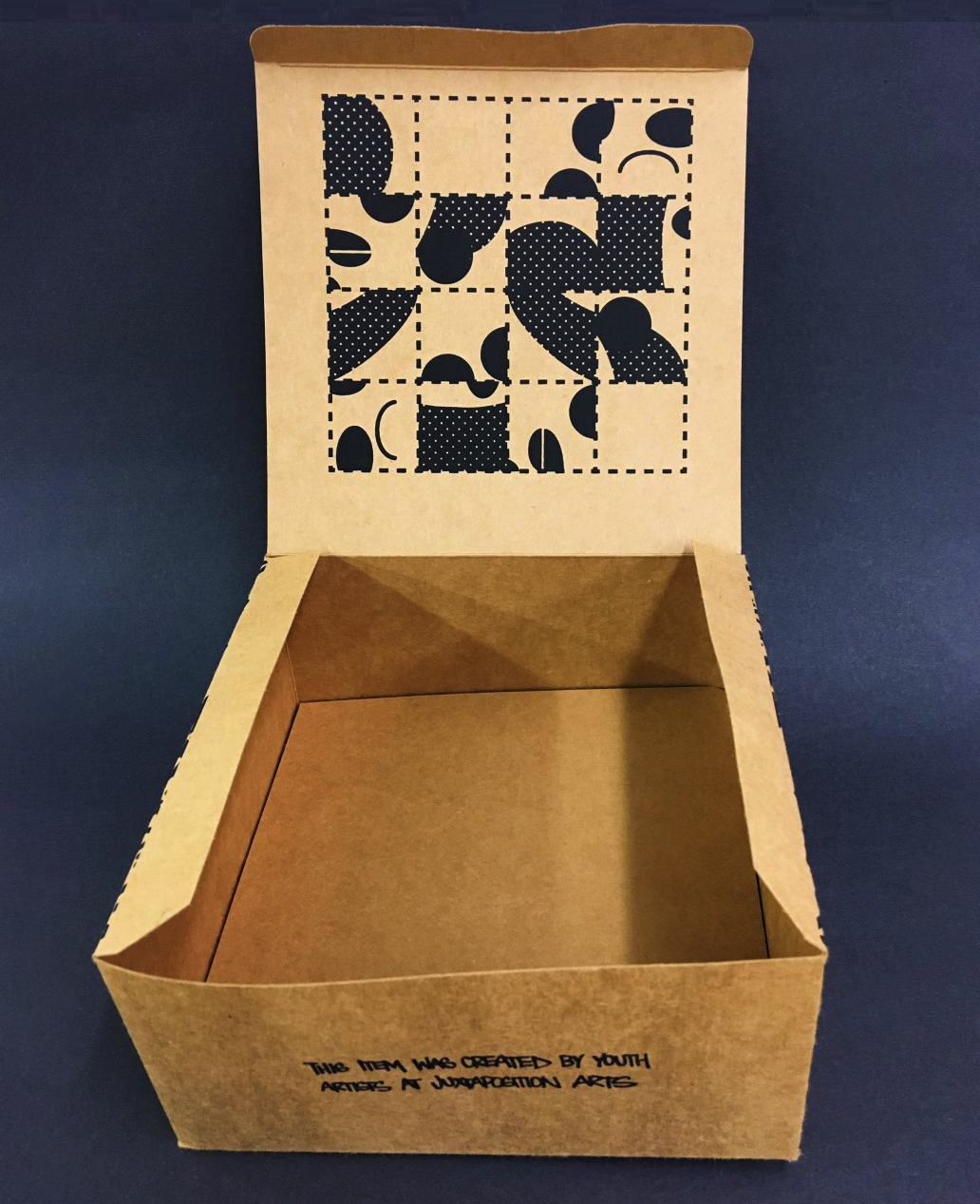
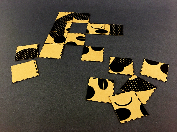
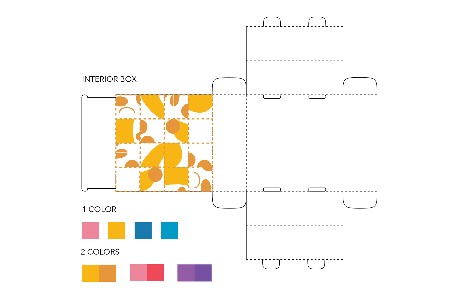
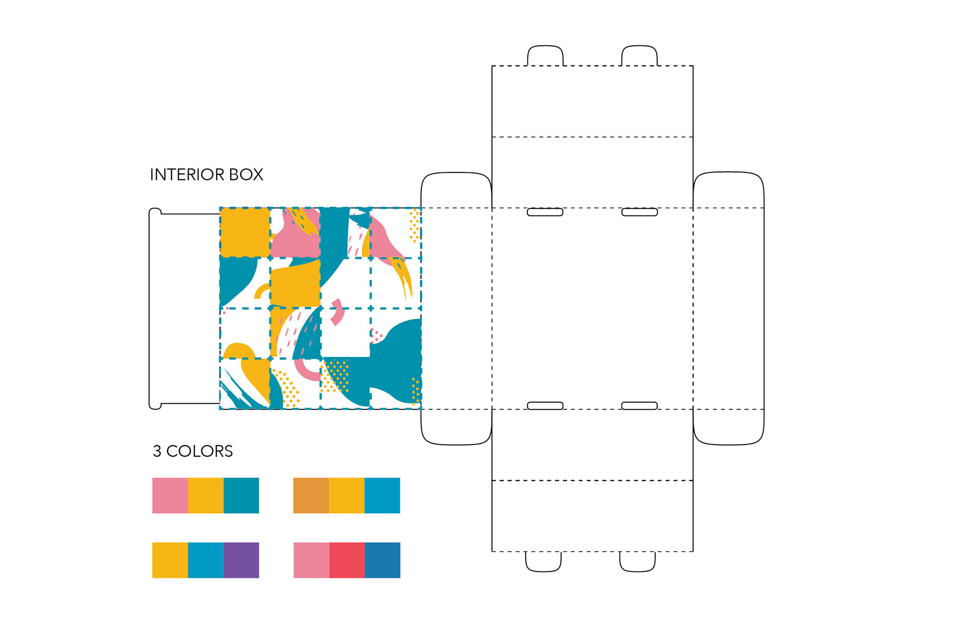
As a way for boxes to be reusable, I illustrated puzzle pieces to be printed in the box. I wanted to make something fun for people to enjoy when they need to keep their brain moving.
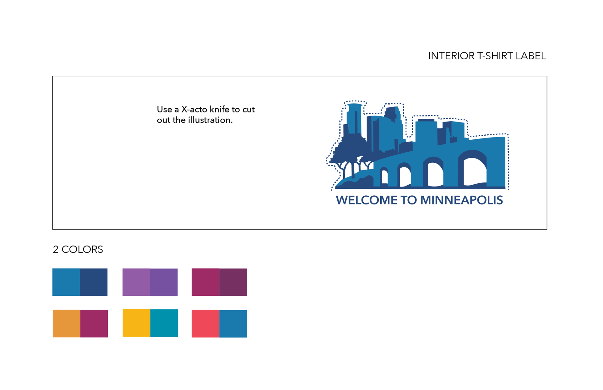
As the same idea for the boxes, I created a pop-up illustration of Minneapolis. We can give something to our community to keep.


As for the moleskine wrap around label, we had an idea to used it as an origami fortune teller. I created the layout of the fortune teller. Then, other apprentices and I came up with tips or phrases to get people out of their box.

The final result of the moleskine label and fortune teller.